HelpButton.qs deepdive
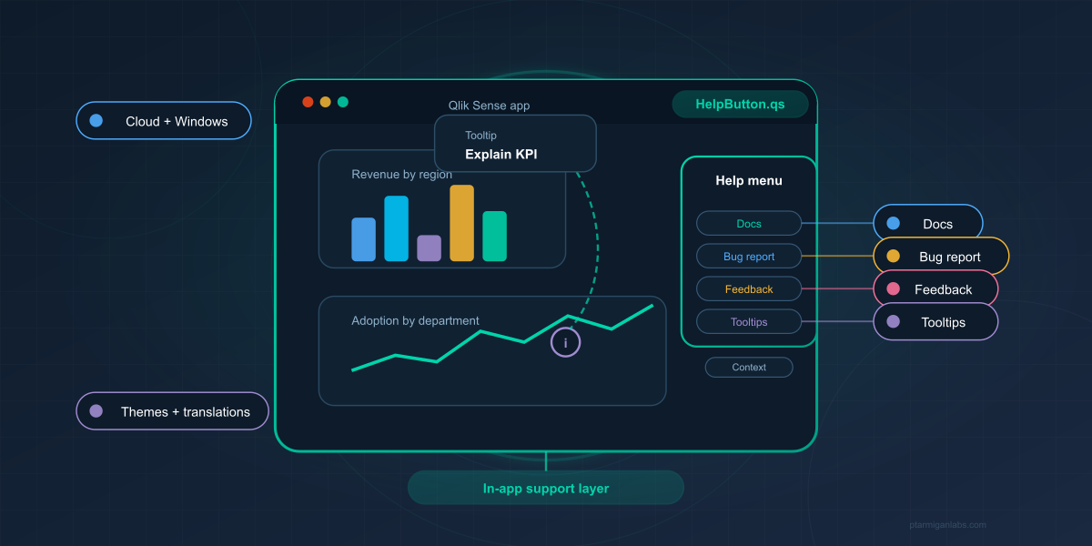
HelpButton.qs deepdive: Move beyond basic help links to build a complete in-app support layer. Discover patterns for contextual documentation, structured bug reports, user feedback, inline tooltips, and multi-language support across Qlik Cloud and client-managed deployments.
On this page
The earlier HelpButton.qs posts covered the launch, the move to a native cross-platform extension, and the addition of feedback, tooltips, theming, and translations. This post takes a different angle. It also reflects HelpButton.qs 3.1, especially the new control over how shared menu items behave across sheets.
If you are a Qlik Sense developer building apps for other people, the interesting question is not just whether you can add a Help button. The real question is how to reduce friction inside the app without cluttering the sheet, sending users to generic documentation, or forcing them into vague support processes.
That is where HelpButton.qs becomes interesting. It gives you a way to design support, documentation, and feedback as part of the app experience itself.
Why HelpButton.qs matters in real Qlik Sense apps
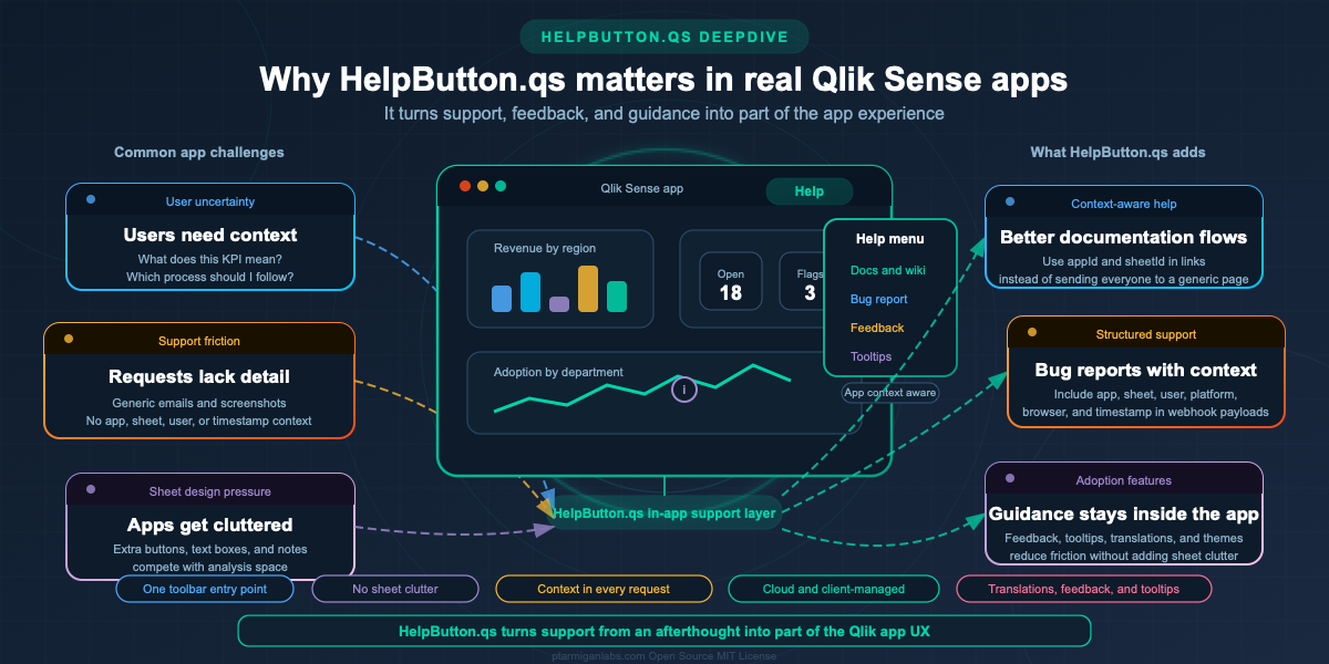
Most Qlik apps do not fail because the charts are wrong (ok, this is slightly opinionated...). They fail because users do not know what they are looking at, which process to follow, or how to report a problem in a way that gives developers enough context to act on it.
In practice, Qlik Sense developers usually need several different kinds of help at the same time:
- A quick link to documentation or a wiki
- A structured way to report defects
- A lightweight way to collect feedback from users who are not reporting a bug
- Inline explanation for specific charts, KPIs, or process steps
- A user experience that works for different languages and different Qlik environments
HelpButton.qs covers all of those needs from a single extension configuration. That matters because it lets you think in terms of an app support model, not just a toolbar button.
It also means you do not need to choose between two bad options: either filling the sheet with explanatory text objects, or expecting users to leave the app and find the right support channel on their own.
Designing help that lives in the toolbar, not on the sheet
One of the most useful ideas in HelpButton.qs is also one of the easiest to miss: the extension is configured on the sheet, but the user-facing help lives in the native Qlik toolbar when the app is in analysis mode.
That has a few practical consequences for app developers.
First, help stays available without competing with charts for screen space. If you are building KPI-heavy dashboards or mobile-friendly sheets, every visible object matters. A support feature that can sit in the toolbar instead of inside the grid is a much better fit than adding another permanent text box or button object.
Second, the button appears where users already look for global actions. That makes HelpButton.qs a good home for resources that are relevant to the whole sheet or the whole app: user guides, release notes, support links, feedback collection, and process help.
Third, the extension can be made almost invisible on the sheet itself in analysis mode, and it can even be hidden completely if you enable Hide widget on sheet in analysis mode. For app developers, that means you can preserve the visual design of the app while still keeping support features close at hand.
This is also a good place to note a practical behavior that matters when designing complex sheets: HelpButton.qs supports multiple extension objects on the same sheet, but they do not create multiple toolbar buttons. Think of multiple instances as cooperating configuration containers, not as a way to build a toolbar full of separate help buttons.
That design pushes you toward a better UX anyway. In most apps, one clear support entry point is better than several competing buttons.
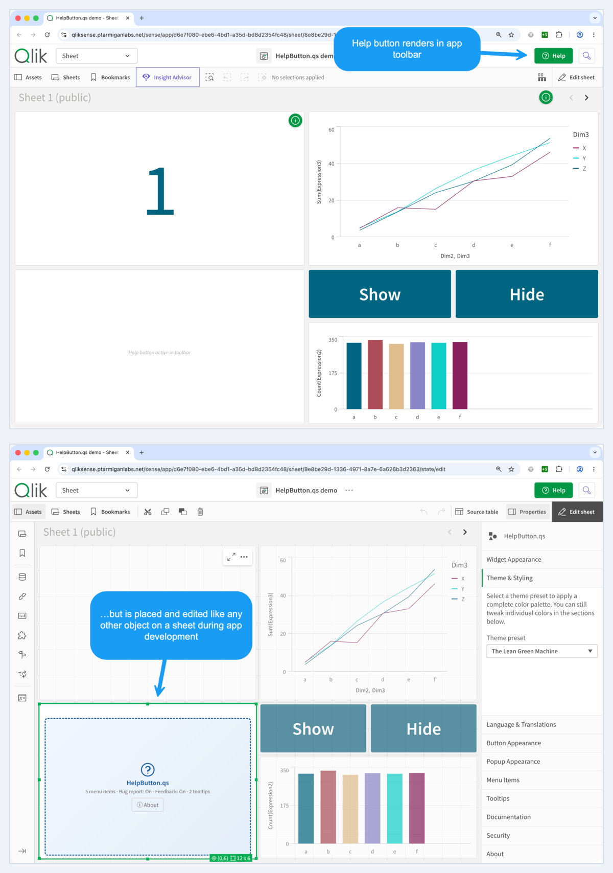
Two practical details are worth calling out:
- The widget can be hidden completely in analysis mode. The screenshot keeps the on-sheet placeholder visible for clarity, but enabling Hide widget on sheet in analysis mode removes that footprint entirely.
- The toolbar button only appears after a sheet containing HelpButton.qs has been loaded. A sheet-local configuration does not contribute anything until that sheet has actually been viewed in the current browser tab. The safest option is to place the extension on the default sheet that opens with the app. If several sheets can act as entry points, place HelpButton.qs on each of them and repeat the same baseline menu items in every instance. In 3.0, duplicated items can then be appended or de-duplicated by merge mode, but the important part is that unvisited sheets do not yet participate in the shared menu.
Managing duplicate menu items across sheets
This is the most important multi-sheet behavior to understand in HelpButton.qs 3.0: a configuration does not become active when you save the app. It becomes active when the user actually visits the sheet that contains that HelpButton.qs instance.
That sounds subtle, but it changes how you should design shared menus.
Imagine a user enters the app on a deep-linked sheet instead of the overview page. In that session, the toolbar menu initially only knows about the HelpButton.qs instances on sheets the user has already visited. If sheet 3 contains a "Definitions" menu item, that item will not appear until sheet 3 has been opened at least once in that browser tab.
That is why the practical recommendation is stronger than "put HelpButton.qs on the landing sheet." If users may enter the app through several different sheets, the reliable pattern is to deploy HelpButton.qs on each of those sheets and configure the same baseline menu items in every instance. That is the only way to guarantee a consistent core menu no matter which sheet the user lands on first.
Once a sheet has been visited, its HelpButton.qs instance joins the shared toolbar button. HelpButton.qs still renders only one toolbar button, but menu items from active instances are merged into the popup. In 3.0 you can control that merging with the Merge menu items setting:
- Append all items keeps every item in registration order. This is the default.
- Merge duplicate labels keeps the first visible item for each label.
- Merge duplicate label + action pairs keeps the first visible item for each label and action combination.
There are two important caveats here.
First, the shared toolbar button takes its shell and merge mode from the first currently registered HelpButton.qs instance. That means the first visited sheet can end up defining the button label, icon, popup styling, and merge behavior for the session until that instance unregisters.
Second, unlabeled structural items such as separators are never de-duplicated. They are always appended in registration order.
For app developers, the design pattern is straightforward:
- Put HelpButton.qs on every sheet that may be a first entry point.
- Keep the same baseline menu items across those instances.
- Use a de-duplication mode if those repeated items should collapse into one shared menu entry.
- Keep the same merge mode across cooperating instances whenever possible.
Two navigation examples make the behavior easier to reason about:
- If the user goes from page 1 to page 2 to page 3, the merged menu grows as each sheet is visited. Page 3 contributes nothing until page 3 has actually been opened.
- If the user enters directly on page 2 from a URL, page 2 becomes the initial base instance for that session. When the user later visits page 1, page 1 can add its menu items into the shared popup, but not before.
That combination of rules is why repeating the same core menu items across all likely entry sheets is not redundant. It is what gives users a stable help menu even when navigation starts somewhere other than the app's intended home sheet.
Building app-specific support and feedback flows
The most effective HelpButton.qs setups are the ones that treat the menu as a small workflow layer for the app.
The extension supports four menu action types, and each solves a different user need:
- Outbound links for documentation, wikis, runbooks, or process pages.
- Bug report dialogs for operational issues that need structured context.
- Feedback dialogs for ratings and comments that are not really defects.
- Set/toggle variable actions for changing app state directly from the help menu.
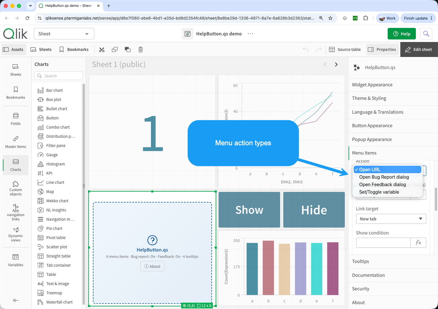
That mix gives Qlik developers a lot of flexibility.
For example, a finance app might have one menu item for "How this app is updated", one for "Definitions and business rules", one for "Report a data issue", and one for "Send feedback". A training-heavy app might use the menu to open onboarding pages, role-based instructions, and a variable toggle that reveals additional tooltip layers for less experienced users.
The important point is that HelpButton.qs is not limited to passive help links. It can support actual app workflows.
There are a few design patterns worth using here:
- Keep the top-level menu short. A small set of clearly named actions is better than a long list of links.
- Separate bug reporting from general feedback. These are different signals and should usually go to different endpoints or processes.
- Use show conditions and expressions where needed. Help for a finance approver does not need to look the same as help for a casual consumer.
- Treat the help menu as a stable control surface. Put actions there that users may need repeatedly, not just one-time onboarding text.
Because most string properties can use Qlik expressions, the menu can also adapt to context. That opens up useful scenarios such as role-sensitive labels, environment-specific endpoints, or help text that changes with selection state.
Working across Qlik Cloud and client-managed environments
One of the reasons HelpButton.qs became much more useful in version 2.0 is that the same extension approach works across both Qlik Cloud and client-managed Qlik Sense.
For app developers, that matters less as an architectural story and more as a deployment and design story.
You can keep the same mental model in both environments: drag the extension onto a sheet, configure it from the property panel, and use the toolbar as your support surface. That consistency is valuable if your team works across mixed Qlik estates or is moving apps from client-managed to Cloud over time.
At the same time, some of the context behaves differently across the two platforms, and that should influence how you design help flows and webhook payloads:
- On Qlik Cloud,
userIdis based on the current user's email address. - On client-managed Qlik Sense,
userIdanduserDirectorycome from the proxy session context. userDirectorydoes not exist on Cloud and resolves to an empty string there.- Some context fields are platform-specific, such as Sense version on client-managed and tenant-related information on Cloud.
This is not a problem, but it does mean your support endpoints and URL templates should be tolerant. If you build a support flow that depends on userDirectory, make sure it degrades cleanly on Cloud. If you store bug reports centrally, include the platform field in the payload and branch downstream logic there rather than assuming one Qlik environment.
Tooltips deserve a similar note. If you target arbitrary page elements using CSS selectors, always test on the platform and client version you actually deploy. A selector strategy that works well on one UI surface may need adjustment on another.
Context-aware links, bug reports, and feedback payloads
This is where HelpButton.qs moves from convenient to genuinely useful.
The extension supports template fields in URLs, including {{appId}}, {{sheetId}}, {{userId}}, and {{userDirectory}}. Those placeholders are resolved when the user clicks, using the live Qlik session context.
That means your links do not need to be generic.
Instead of sending every user to the same documentation landing page, you can send them to the page for the app and sheet they are actually using:
https://docs.example.com/qlik/apps/{{appId}}/sheets/{{sheetId}}
That same context-aware thinking is even more valuable in bug reports and feedback dialogs.
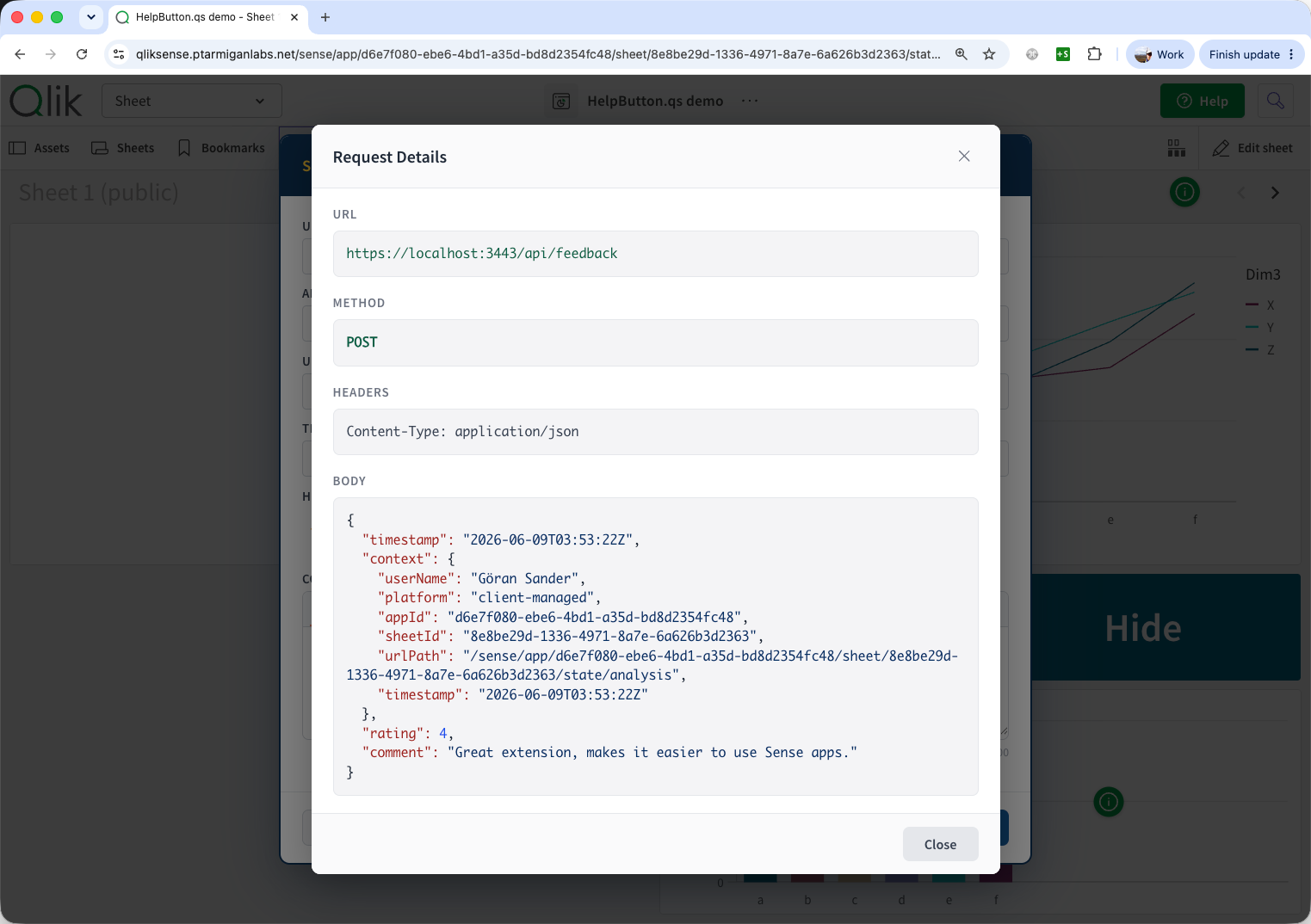
When users submit a bug report or feedback entry, HelpButton.qs can include context such as app ID, sheet ID, user details, platform, browser, URL path, and timestamp. For a Qlik developer or support team, that is the difference between a vague message like "the chart is wrong" and a report that can actually be investigated.
It also makes it easier to design clean backend workflows:
- Route bug reports and general feedback to different endpoints.
- Use app and sheet identifiers to pre-triage incoming issues.
- Standardize timestamp formats to match your downstream systems.
- Rename payload keys when your database or API expects a specific field naming convention.
Another small but important detail: when a template field cannot be resolved, HelpButton.qs replaces it with an empty string and cleans up resulting double slashes in the URL path. That makes dynamic URLs much safer to use in real deployments, especially when users move between app overview pages and actual sheets.
For app developers, the practical recommendation is simple: design support flows that assume context is available and useful. Generic links and free-text emails are still possible, but they leave a lot of value on the table.
Tooltips, translations, and theming for better adoption
The big risk with any support feature is that it exists, but users either do not notice it or do not trust it enough to use it.
This is where the 2.1-era features make HelpButton.qs much more practical in production apps.
Tooltips for guidance in context
Toolbar help is useful for app-level guidance. Tooltips solve a different problem: helping users understand a specific chart, title, or interaction exactly where they are working.
The way this works on the sheet is straightforward: small tooltip icons appear next to the objects they describe. When users hover over those icons, the tooltip content appears as a popup. Clicking the icon opens a larger dialog for more detailed guidance.
HelpButton.qs tooltips can target either Qlik Sense objects or arbitrary page elements through CSS selectors. That gives you two useful modes:
- Attach explanation directly to a chart or KPI.
- Extend help beyond the sheet grid when a selector is more appropriate.
There is one important difference compared with the toolbar button: tooltips are sheet-specific. The toolbar button can persist once HelpButton.qs has been activated on a sheet, but tooltip icons are registered from the extension instances that exist on the current sheet and are removed again when you leave it. If you want tooltip icons on three different sheets, you need a HelpButton.qs instance on each of those sheets.
The hover popup and the optional click dialog both support Markdown, which makes the feature much more useful than a plain text tooltip. You can add headings, lists, links, screenshots, and even richer explanatory content where needed.
Used well, tooltips help you remove clutter from the sheet. Instead of placing long explanatory text directly on the canvas, you can keep the default view clean and reveal deeper guidance only when the user asks for it.
Controlling tooltip visibility
Tooltip icons do not have to be visible all the time. The Show condition field in each tooltip lets you decide whether the icon should be rendered at all.
The simplest setup is to bind one or more tooltips to a Qlik variable such as vShowTooltip:
=if(vShowTooltip = 1, True(), False())
With that pattern:
vShowTooltip = 1shows the tooltip icon.vShowTooltip = 0hides it completely.- The same variable can control several tooltip icons at once if you give them the same show condition.
That opens up two useful ways to control visibility.
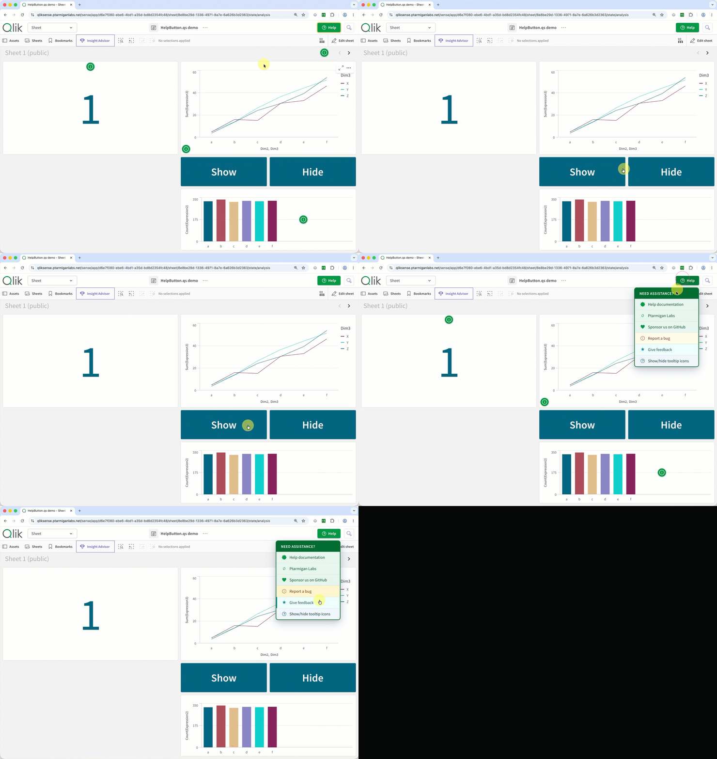
The first is to use a normal Qlik button object on the sheet. A pair of Show and Hide buttons can set the variable directly, which works well when you want users to explicitly switch helper icons on and off while they stay on the same sheet.
The second is to control visibility from HelpButton.qs itself. A menu item in the toolbar can use the Set/Toggle variable action type and flip the same variable between 1 and 0. That turns the help menu into its own tooltip visibility switch, which is useful when you want to keep the sheet itself as clean as possible.
This approach works especially well when you want tooltip guidance to be optional. New or less frequent users can turn the helper icons on, while experienced users can hide them again once they know the app.
Flexible positioning
Tooltip icons are not locked to a single corner. You can anchor them to the top, center, or bottom of a target object, place them on the left or right edge, or use percentage-based positioning for more precise placement inside the target area.
If you want even more flexibility, the Floating (drag to move) option lets end users reposition the icon within the target element. That is useful when a tooltip starts in a sensible default location, but different users may want to move it slightly to avoid overlapping a label, legend, or chart mark.
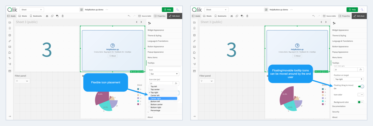
The static comparison above shows the two positioning ideas side by side. The animation below shows what floating mode looks like in practice when the icon is moved to a better spot within its associated chart object.

Video in hover popups and click dialogs
One useful detail that is easy to miss is that video embedding is not limited to the tooltip click dialog. Both the tooltip's hover popup content and its click dialog content can contain videos.
For hover content, the simplest option is the Markdown video shorthand:
@[Product walkthrough](https://www.youtube.com/embed/Uvfig5FjfBU)
That kind of snippet works well when you want a compact visual hint directly in the hover popup. The same idea also works in the click dialog, either with the Markdown shorthand or with raw HTML <iframe> / <video> markup when you want more control over the embed.
In practice, the hover popup is better for short clips or quick visual examples, while the click dialog is the better place for longer walkthroughs because it gives the video more room.
Designing click dialogs
The hover popup is best for short, glanceable guidance. The click dialog is where you can go further: step-by-step instructions, screenshots, richer formatting, and media that would be too heavy for a small hover popup.
In practice, a good tooltip dialog behaves like a compact in-app help panel. Keep the hover popup short enough to answer "what is this?" and use the click dialog to answer "how do I do this?" or "show me an example." Videos can work in both places, but the click dialog is usually the better place for them.
Dialog size matters too. Small and Medium work well for short instructions, but if you are embedding video or writing a more complete walkthrough, Large or X-Large is usually the better choice.
HelpButton.qs supports both Markdown video shorthand and raw HTML <iframe> / <video> markup in tooltip dialogs. Raw HTML is useful when you want more explicit control over the embed, for example setting a fixed YouTube iframe size.
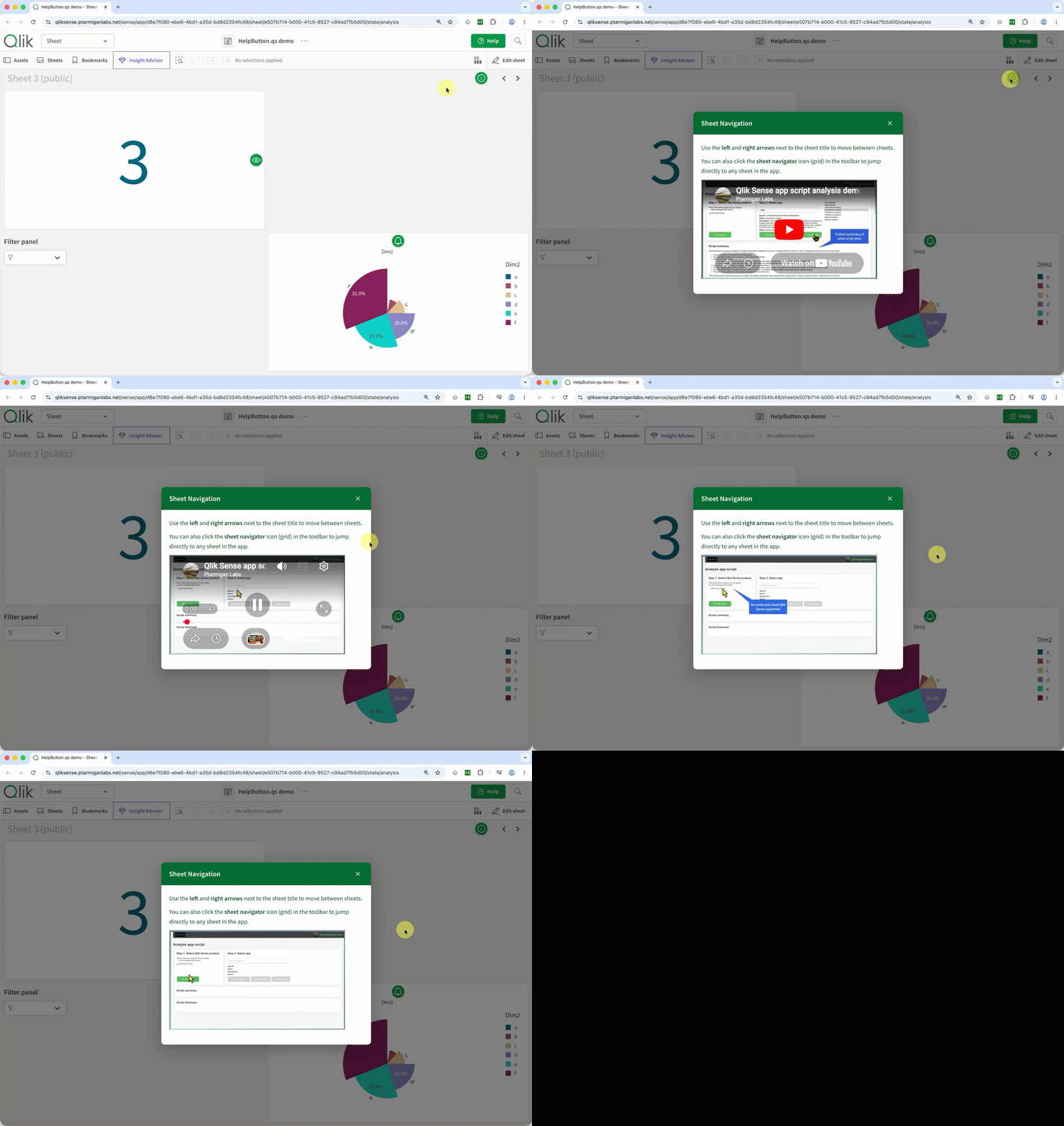
A tooltip click dialog can contain content like this:
Use the **left** and **right arrows** next to the sheet title to move between sheets.

You can also click the **sheet navigator** icon (grid) in the toolbar to jump directly to any sheet in the app.

<iframe
    width="400"
    height="225"
    src="https://www.youtube.com/embed/Uvfig5FjfBU"
    allowfullscreen
></iframe>
If you use an iframe or embedded video source like this in either hover content or click dialog content, the source URL should be covered by Allowed URI prefixes in the extension's Security section. For the example above, a safe setting would be a YouTube embed prefix such as https://www.youtube.com/embed/. If the Allowed URI prefixes field is left empty, HelpButton.qs allows all https:// video and iframe sources that match the supported rendering rules.
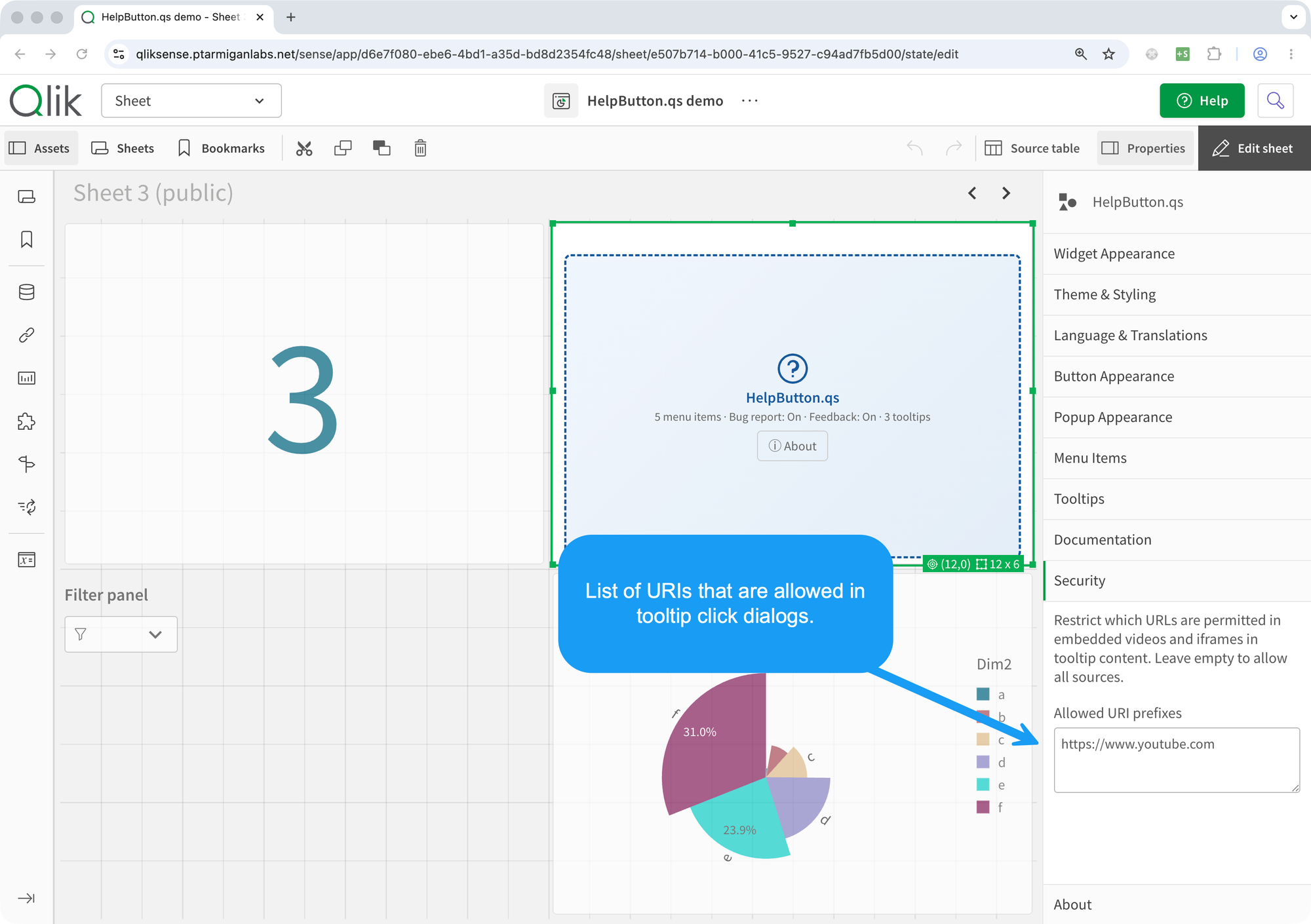
The animation below shows the end result: a tooltip click dialog behaving like a mini help panel, with an inline video embedded directly in the modal.
Using CSS selectors outside charts
CSS selectors are what make HelpButton.qs tooltips useful beyond chart objects. They let you attach a tooltip to page elements that are part of the Qlik UI itself, not just to visualizations listed in the object dropdown.
For example, in client-managed Qlik Sense November 2025, each app sheet's header bar can be targeted by setting:
- Target type to
CSS selector - CSS selector to
#sheet-title > header
That is a good pattern when you want to explain sheet-level navigation or actions that live in the header rather than inside a specific chart.
#sheet-title > header

Example: in client-managed Qlik Sense November 2025, #sheet-title > header targets the sheet header bar. That makes it possible to attach a tooltip to the sheet title area instead of to a chart object.
There are two practical caveats to keep in mind:
- Only the first element that matches a CSS selector gets the tooltip icon.
- CSS selectors are version- and platform-specific, so a selector that works in client-managed November 2025 may need to be adjusted in later releases or in Qlik Cloud.
When possible, prefer stable attributes such as tid, role, or test-oriented data attributes. Avoid fragile copied selectors based on nested nth-child(...) paths unless you are willing to maintain them over time.
Translations that work by default
Multi-language support is easy to underestimate until you have to support a real user base across regions or business units.
HelpButton.qs includes built-in translations for nine languages and can auto-detect the user's Qlik UI language. That is a strong default because it lowers the amount of text maintenance required from the app developer.
The supported languages are:
- English (
en) — also the ultimate fallback for unsupported locales - Swedish (
sv) - Norwegian (
no) - Danish (
da) - Finnish (
fi) - German (
de) - French (
fr) - Polish (
pl) - Spanish (
es)
The key behavior to understand is this: when you leave translatable text fields empty, the extension fills in the right built-in text for the active language. If you type your own text, your custom value wins.
That gives you a few useful modes of operation:
- Leave everything empty and let the extension translate itself automatically.
- Force one language for all users of a specific app.
- Override only the strings that need custom wording while leaving the rest on built-in defaults.
The practical trade-off is worth stating clearly: custom text entered in the property panel is not automatically localized per user. If you need full language sensitivity, keep custom overrides to a minimum or maintain them deliberately.
Theme presets and trust
Theme presets may look like a cosmetic feature, but they matter because help and feedback features are used more when they feel like part of the app rather than an afterthought.
If the button, popup, dialogs, and tooltips align with the visual language of the app, users are more likely to recognize them as first-class controls. For many teams, the built-in presets are enough to get most of the way there, with a few targeted overrides for branding.
In other words: theming is not just decoration. It supports adoption.
Patterns Qlik developers can reuse in their own apps
The most useful way to think about HelpButton.qs is as a collection of design patterns for self-service analytics.
Here are a few patterns that are worth reusing.
1. Replace generic support links with context-rich support actions
If a user can report a problem from inside the app, with app and sheet context attached automatically, you reduce both user effort and support back-and-forth.
2. Keep app-level help global, and chart-level help local
Use the toolbar for resources that belong to the whole app experience. Use tooltips for explanations tied to a specific object, metric, or interaction.
3. Design for mixed audiences
Business users, power users, and app owners often need different help paths. Use menu items, show conditions, expressions, and tooltip visibility rules to expose the right amount of support to the right audience.
4. Separate learning from incident handling
Documentation links, feedback dialogs, and bug reports should not all be treated as the same thing. They serve different purposes and should lead to different operational processes.
5. Make multilingual behavior the default, not an afterthought
If your app will be used across languages, start with auto-detect and built-in translations. Add custom wording only where the business really needs it.
6. Use support features to reduce sheet clutter
If a chart needs a long explanation, do not automatically put that explanation on the canvas. A tooltip or dialog may give users a cleaner experience while still making the information available.
These are all reusable patterns, even if you only end up using half of the extension's feature set.
Explore the project and try it yourself
If you have only looked at HelpButton.qs as a way to add a custom help link, it is worth taking a second look. The extension is now much better understood as a configurable support layer for Qlik Sense apps: one that can combine documentation, operational reporting, user feedback, inline guidance, and localization in a way that stays close to the user's actual workflow.
The project is open source and available on GitHub:
- HelpButton.qs project home
- App developer documentation
- Menu items app developer guide
- Template fields documentation
- Multi-language documentation
- Tooltips app developer guide
- HelpButton.qs 3.0 release notes
If you are building Qlik apps for other people, that is probably the right lens for evaluating HelpButton.qs: not as a button, but as an app design tool for support and adoption.
As with all Ptarmigan Labs projects, HelpButton.qs is open source under the MIT license.